- Joined
- Dec 4, 2024
- Messages
- 14
Hey fellow developers! 

Key features:
Key features:
Key features:
Key features:
Key features:
1. Copy the HTML structure:
2. Add the CSS to your stylesheet
3. Customize colors and sizes to match your brand
4. Replace "your-download-link" with your actual download URL
Feel free to modify these buttons! Some ideas:
1. 3D effect not working?
2. Gradient animation choppy?
3. Neumorphic shadows look off?
All buttons are mobile-friendly, but keep in mind:
Feel free to use these buttons in your projects! If you make any cool modifications, share them in the comments below.
Happy coding!
Note: Remember to test thoroughly in your target browsers and adjust the styles as needed for your specific use case.
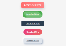
I wanted to share some modern, eye-catching download button designs I created using pure HTML and CSS. No JavaScript required! These buttons are perfect for adding some flair to your projects while maintaining good UX principles.

 The Button Collection
1. 3D Glossy Button
This button gives users a premium feel with a beautiful gradient and 3D effect.
Code:
.btn-3d {
  background: linear-gradient(45deg, #ff6b6b, #ff8787);
  transform-style: preserve-3d;
  transform: perspective(1000px) translateZ(0);
}- Depth perception using CSS transform
- Smooth gradient background
- Enhanced shadow on hover
- Rises up when hovered
2. Cartoon-Style Button
Perfect for gaming sites or child-friendly interfaces!
Code:
.btn-cartoon {
  background-color: #4CAF50;
  border: 4px solid #45a049;
  font-family: 'Comic Sans MS', cursive;
}- Thick, playful borders
- Comic Sans font (don't judge!
 )
) - Shine animation effect
- Scale animation on hover
3. Modern Minimal Button
For those who prefer a clean, professional look.
Code:
.btn-modern {
  background: #2c3e50;
  letter-spacing: 2px;
}- Understated design
- Sliding underline animation
- Perfect for corporate sites
- Excellent readability
4. Gradient Animated Button
Adds life to your page with smooth color transitions.
Code:
.btn-gradient {
  background: linear-gradient(-45deg, #ee7752, #e73c7e, #23a6d5, #23d5ab);
  background-size: 400% 400%;
  animation: gradient 15s ease infinite;
}- Continuous flowing gradient
- Smooth color transitions
- Pill-shaped design
- Subtle lift effect
5. Neumorphic Button
Jumping on the soft UI trend with this modern take.
Code:
.btn-neumorphic {
  background: #e0e5ec;
  box-shadow:
    8px 8px 15px #a3b1c6,
    -8px -8px 15px #ffffff;
}- Soft shadow effects
- Press-in animation
- Modern "soft UI" design
- Subtle depth changes
 Implementation Tips
- Accessibility: All buttons have proper hover and active states for better user feedback.
- Responsiveness: The buttons adapt well to different screen sizes.
- Performance: No heavy animations that might impact page performance.
- Browser Support: Works in all modern browsers (Chrome, Firefox, Safari, Edge).
 How to Use
1. Copy the HTML structure:
Code:
<a href="your-download-link" class="btn-[style-name]">Download Now</a>2. Add the CSS to your stylesheet
3. Customize colors and sizes to match your brand
4. Replace "your-download-link" with your actual download URL
 Best Practices
- Keep the button text short and clear
- Ensure enough contrast for accessibility
- Maintain consistent sizing across your site
- Test hover states on mobile devices
 Customization
Feel free to modify these buttons! Some ideas:- Change the color schemes
- Adjust animation timings
- Modify the shadow intensities
- Add your own hover effects
 Common Issues & Solutions
1. 3D effect not working?- Make sure you have the proper vendor prefixes
- Check if perspective property is supported in your target browsers
2. Gradient animation choppy?
- Try reducing the animation duration
- Consider using `transform` instead of background-position
3. Neumorphic shadows look off?
- Adjust the shadow colors based on your background color
- Keep the shadow distance proportional to button size
 Mobile Considerations
All buttons are mobile-friendly, but keep in mind:- Touch devices don't have hover states
- Consider making buttons larger for touch targets
- Test shadow effects on different screen densities
 Contributing
Feel free to use these buttons in your projects! If you make any cool modifications, share them in the comments below.Happy coding!
Note: Remember to test thoroughly in your target browsers and adjust the styles as needed for your specific use case.
Attachments